Uber Design Playground Week 2023
Brand Identity
Visual identity for the internal Uber Design event.
Playground Week is a design-led, cross-functionally inclusive, global hackathon week focused on rapid prototyping and collaboration. The event is hosted every December by all Uber Design orgs.
Every year, Playground Week has a unique theme that serves as a baseline for all designers to ideate around. Playground Week is meant to be fun, energizing, and provide designers within all Uber Design orgs with an excuse to work on ideas outside of their day-to-day roadmaps. In 2023, the theme we chose was Surprise & Delight. For Uber Delivery, "Surprise & Delight" can mean anything from the delight of effortlessly building a grocery cart to the surprise of discovering a neat power-user feature.
Like every good design-led event, Playground Week usually has its unique, fun branding to celebrate the occasion. This time around, my friend and colleague Catherine Wang and I got to design the 2023 PGW identity.
Initial Explorations
Once the theme was defined, we started jamming on how we wanted this year's event to feel. We aimed for an identity that felt playful yet strong. One that could extend to many touchpoints across the event (think Google Docs, Slides, Sheets, Figma mocks, etc.) and could be reused effortlessly by participants from all design areas, from Product Designers to UXR or Content Designers.
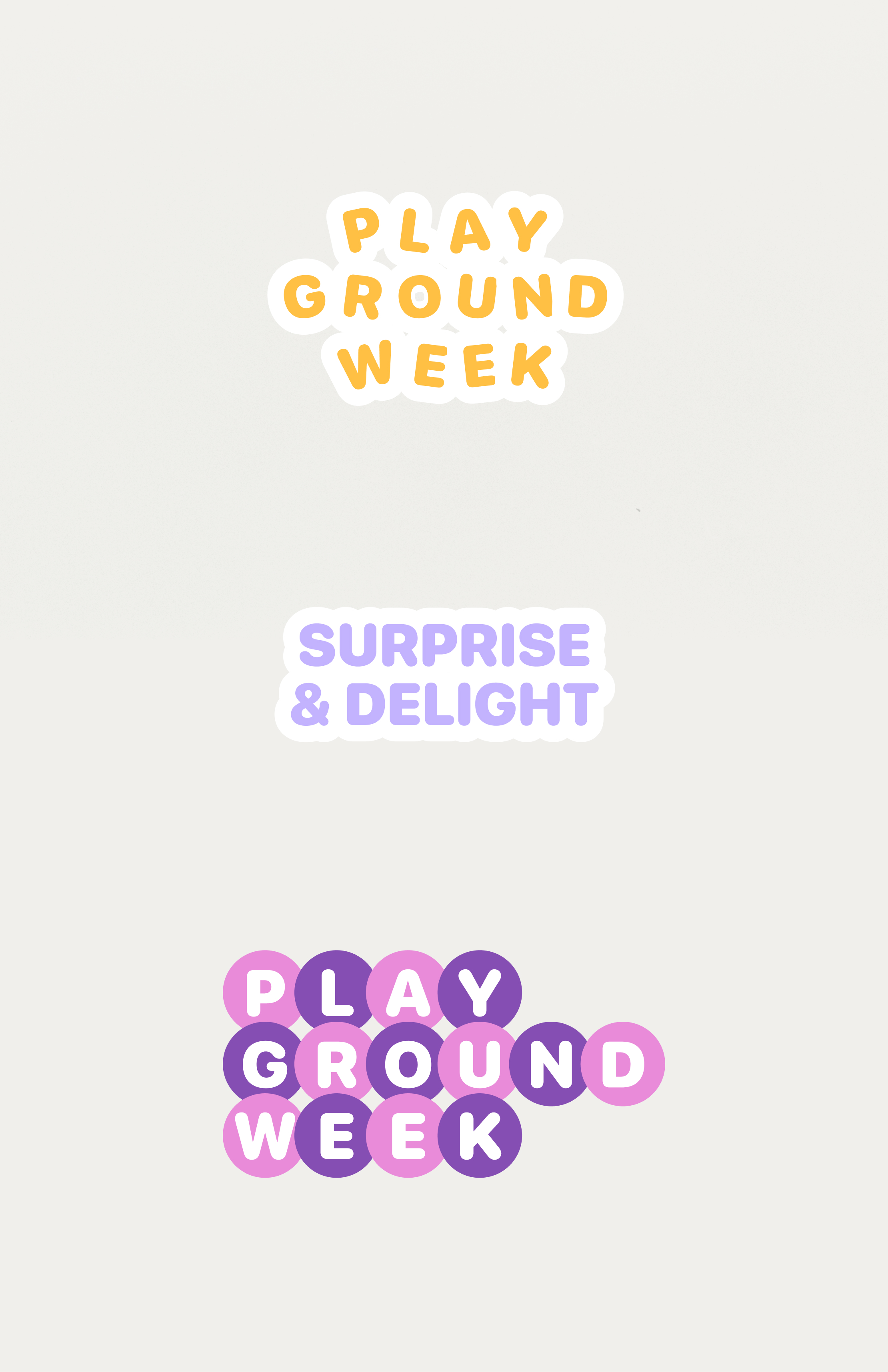
Initially, we explored playing with rounded typography with cloudy vibes to nod to the "Playground" concept. Though cute, this approach quickly proved itself too generic, and thus hard to extend across surfaces without feeling like something that could refer to anything. It was clear we needed to go bolder.
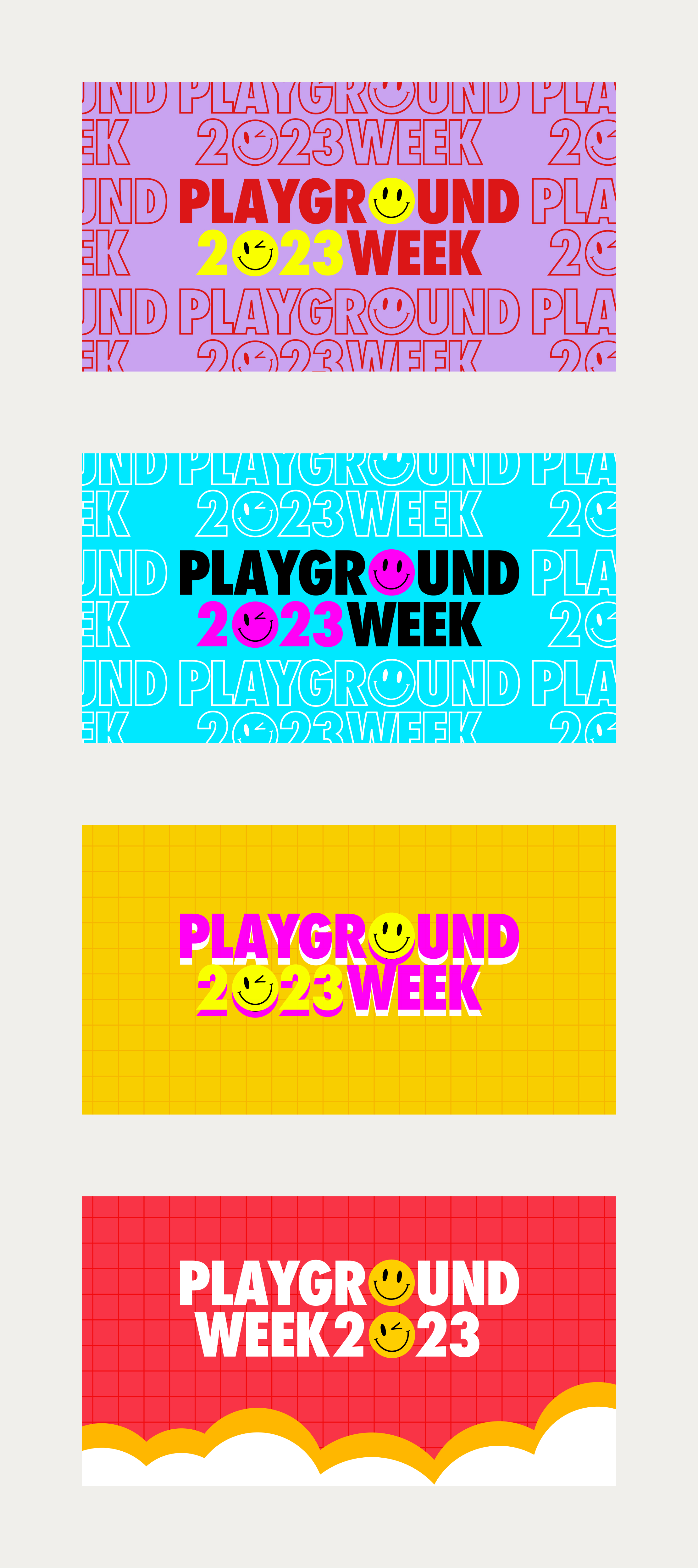
But then… The smiley appeared. It was a small & subtle detail, yet flexible and recognizable enough to work across different levels and surfaces. We started merging our initial explorations with these new ones until we eventually got our explorations down to four contenders.
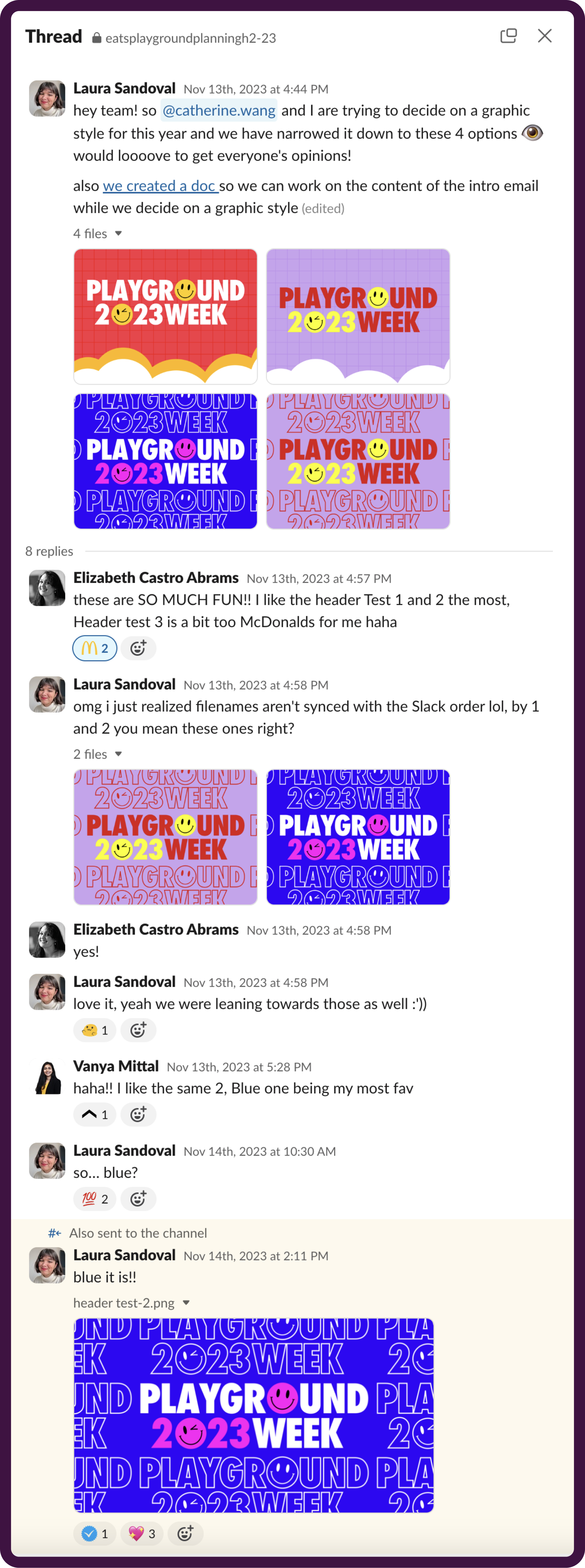
Catherine and I collected feedback from the broader planning group, and after a quick back-and-forth, we had a winner!
Extending The Brand
After landing on a final brand direction, it was time to make sure everything related to Playground Week felt like Playground Week.
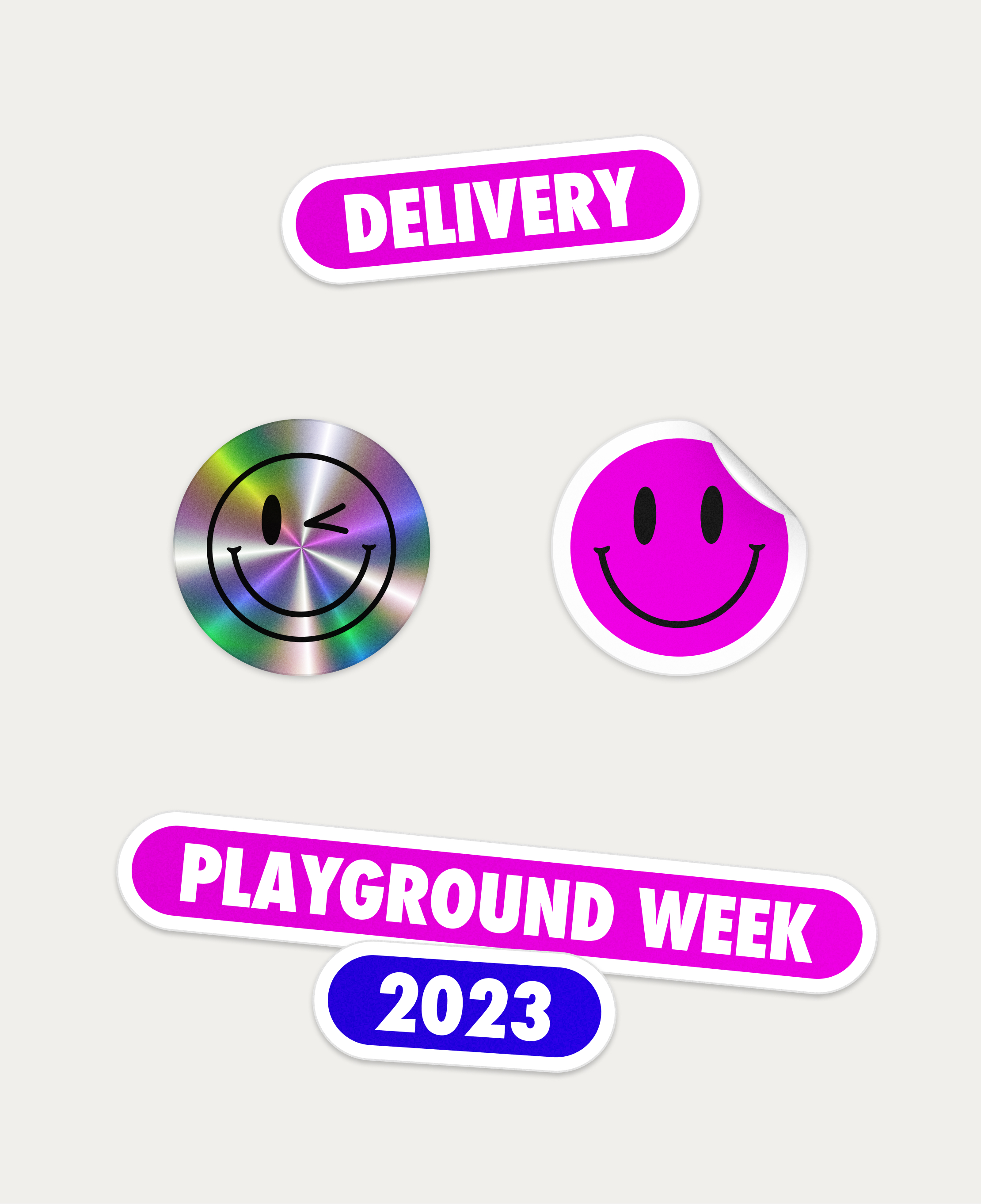
To further consolidate a cohesive brand sentiment and expand the brand's versatility, we designed these Pink & Blue stickers to reuse on Sheets, Docs, Slides, etc., as well as a shiny one to add a bit more dynamism.
Final Results
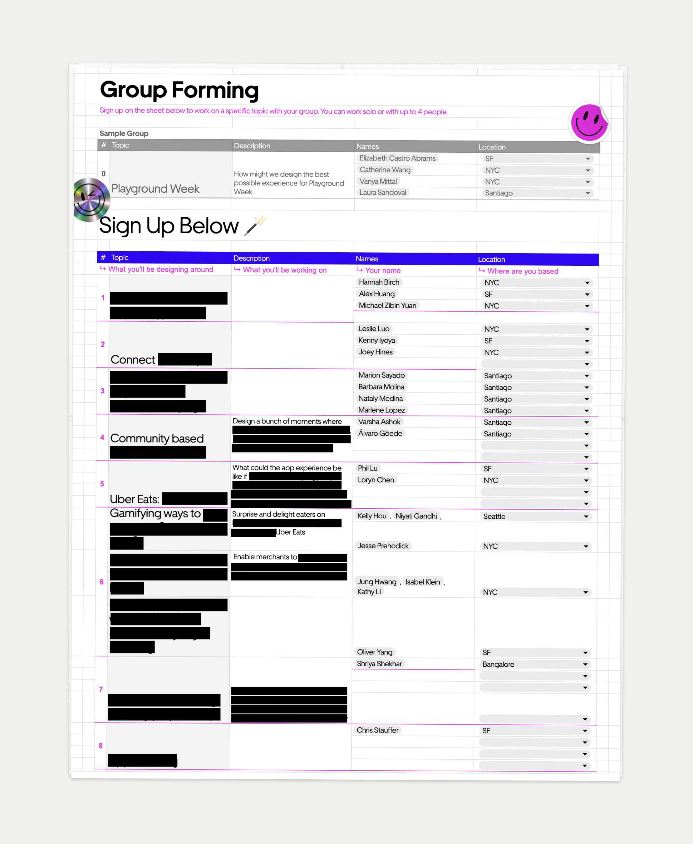
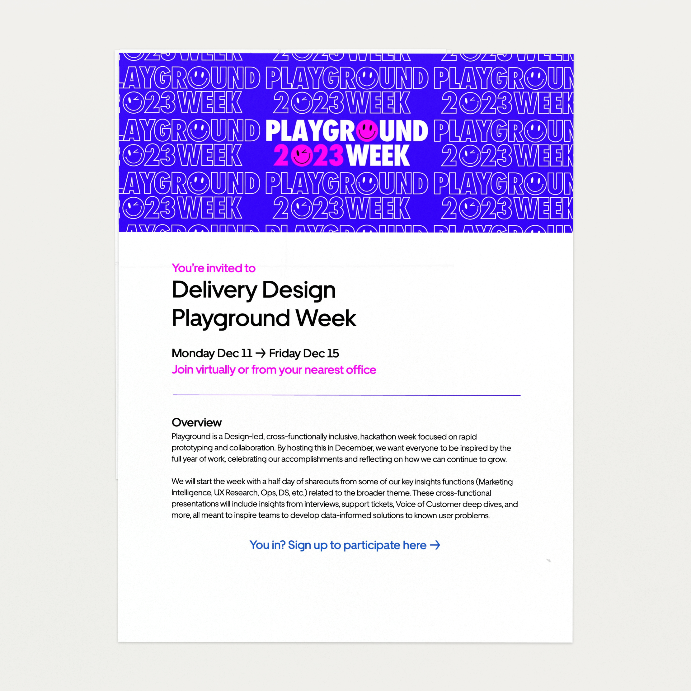

This was definitely one of my favorite projects from 2023, and both I and the broader Delivery Design team were so happy with the results from the branding, as well as the actual Playground Week projects—which, needless to say, are confidential, so you'll just have to trust me on that one.
Period
2023
Client
Uber
Sector
Delivery
Corporate
Discipline
Brand Identity
Design
Catherine Wang
Laura Sandoval
Playground Week Planning
Elizabeth Castro Abrams
Catherine Wang
Vanya Mittal
Laura Sandoval
